Natural colors that will bring home style and peace in 2020.
Friday, January 3, 2020

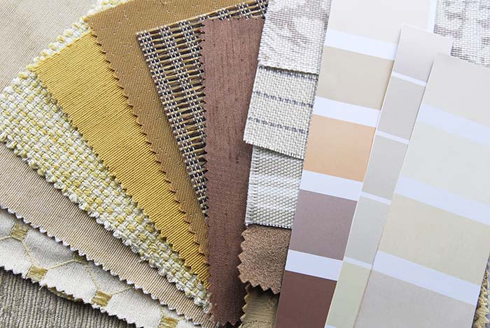
Whether you’re looking for a new color palette for your home, are hoping to find a better state of mind or both, you might try some of these paints.
Bask in the blues
- Creates a calming effect
- Has been found to reduce crime
- Reminiscent of clear skies and peaceful waters
PPG named Chinese Porcelain its Color of the Year, while Sherwin-Williams chose Naval SW 6244. Both are deep, rich blues and are a bit more reminiscent of night skies than sunny spring days. They’re ideal for a nautical or coastal vibe, but don’t rule them out for an Art Deco-styled room, either.
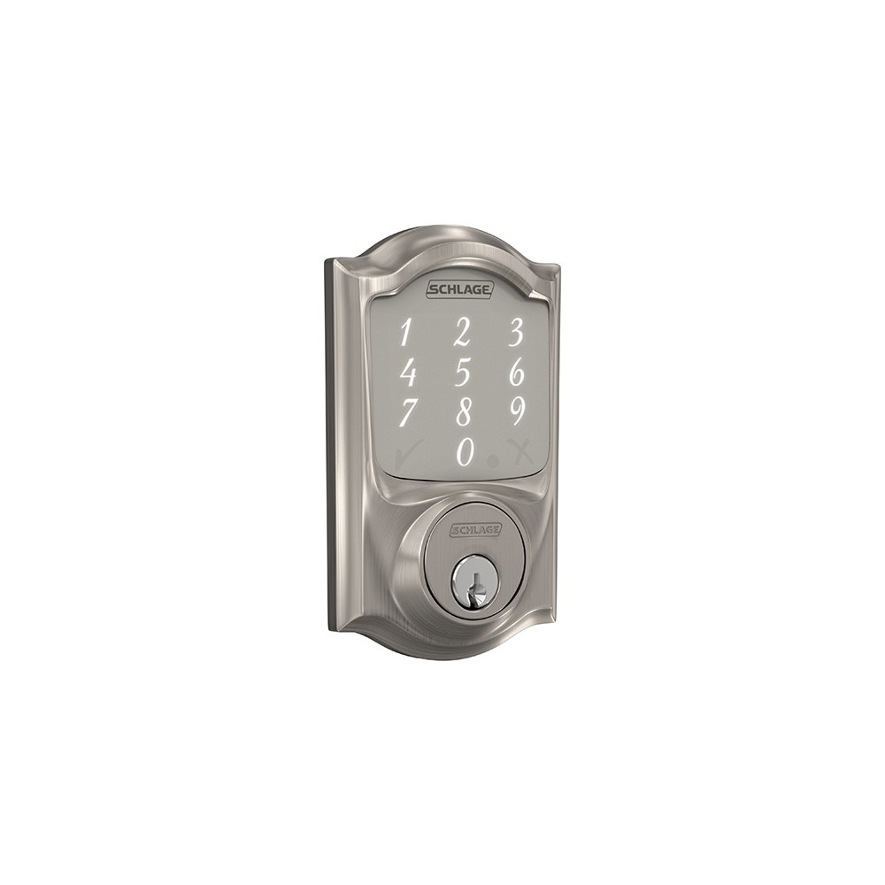
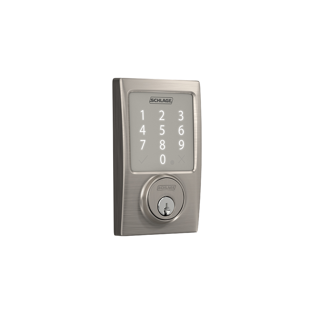
Unless you love a big statement, accent walls might be more appropriate for these bold blues. You could also pair them with a more neutral wall and make the Chinese Porcelain or Naval really pop with rugs, pillows and other room accessories in those colors. Satin Brass or Satin Nickel door hardware finishes would stand out nicely against the darker, rich paint colors.
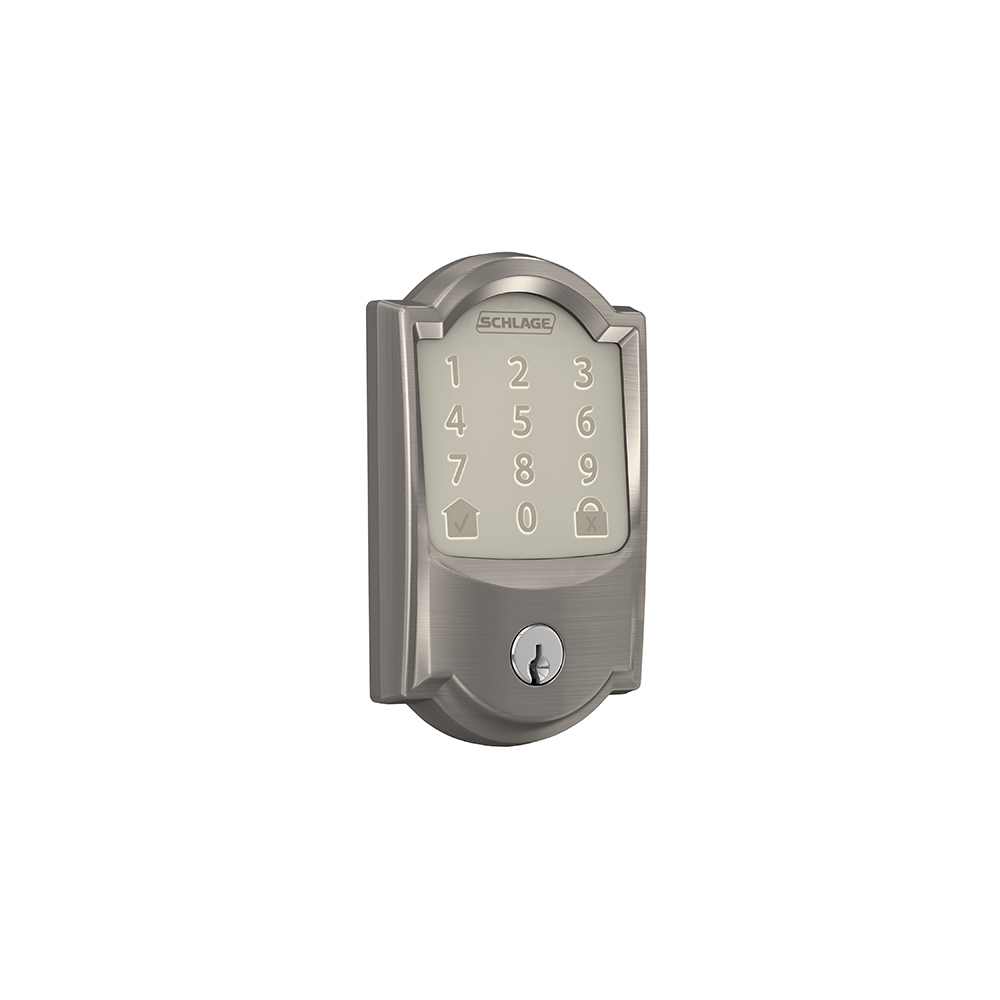
Valspar couldn’t be contained to just a single color of the year and instead named 12. Of those, two are from the blue family – Utterly Blue, which definitely has you feeling like a trip to the beach, and Grey Brook, a classic neutral with blue undertones. Matte Black and Satin Chrome finishes play well off the blue and gray tones in this case.
Get your greens
- Represents tranquility and health
- Creates calming and refreshing effects
- Complements popular plant-inspired designs in wallpapers, pillows and more
Valspar felt so strongly about the benefits of green that they picked four colors in that family for 2020. Tempered Sage, Secret Moss and Mint Whisper each have a more muted, earthy feel to them, while Secluded Garden offers a jewel-toned option. Behr’s Back to Nature, as its name implies, is closer to the earthy shades. This yellow-green hue is the perfect complement to brown tones in your home. It also brings a level of versatility in that you can easily use it in any room.
Balance yourself with browns
- Creates feelings of warmth and security
- Earthiness provides a sense of stability
- Neutral quality of the color brown makes a stunning backdrop for a variety of styles
Like it did with green, Valspar embraced a range of browns, so there’s a little something for everyone. Its greige Winter Calm and Desert Fortress, with a familiar tan feeling, are updated classics with wide appeal. We recommend Matte Black or Satin Chrome finishes for rooms and doors painted with these browns.
Please with pale pinks
- Associated with kindness and love
- Promotes feelings of joy, happiness and creativity
- Coordinates well with blues, greens and greys
Benjamin Moore’s First Light, HGTV HOME® by Sherwin-Williams’ Romance and Valspar’s Crushed out are all blush pinks. They’ve been described as soft and dreamy, as well as fresh and playful. Their success comes in part from their subtlety rather than an in-your-face brightness, especially when paired with other soft gray, blue or even golden tones.
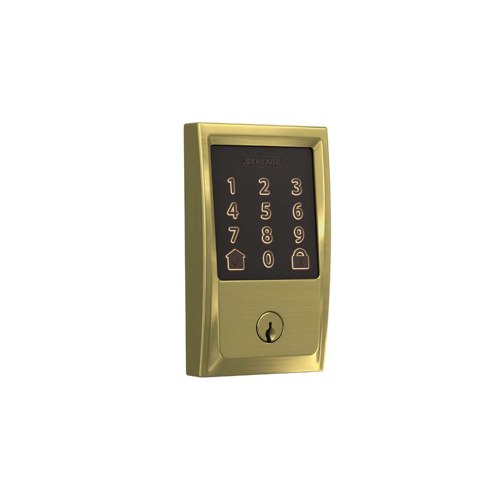
Valspar rounded out its list with Bombay Pink, giving a cheerier punch to the list. Whereas the other pinks are more muted, this brighter shade could be for those who like a stronger style statement, especially if they love gold accents, or Bright Brass door hardware, throughout the room.
No matter what color you choose to paint your walls, doors or even your ceilings – an Utterly Blue ceiling would really be committing to the sky metaphor – the accessories, fixtures and fabrics you select can truly impact the statement you make about your personal style.
Visit our website to see all available Schlage door hardware finishes. And if you’re looking for more style inspiration, there’s our interactive Style Selector at Schlage.com or our Pinterest and Instagram accounts.