4 spring color combinations to wake up your front porch.
Wednesday, April 24, 2019

Springtime. You’re ready to break free from the drab winter, so it’s the perfect time for a color explosion.
Springtime. You’re ready to break free from the drab winter, so it’s the perfect time for a color explosion. Whether you’re itching to douse your home with as many colors as possible or you’re hesitant to go too bold when decorating for the new season, never fear. We have a range of suggestions for front porch spring color palettes perfect for any taste.
Unlike fall color palettes for your porch, which generally rely on rusty reds, browns, oranges and yellows, spring palettes give you a wider range of options. You’ll typically see more primary colors – blue, yellow, red – but even these can run the gamut from a tropical splash to a subdued beachy pastel.
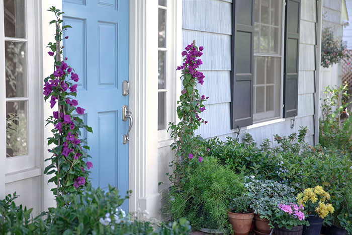
Yellow + Blue + Green
This combination often balances hues found in nature – think green – with unexpected punches of contrast – hello, yellow! Ann from On Sutton Place kept her spring front porch decor simple, but that hardly makes it dull. A blue lantern, greenery in the planters and yellow sprinkled throughout pillows, the door mat and flowers, give this a cohesive and classy look. It’s also a perfect example of how to use neutral-colored furniture as a backdrop for more vibrant hues as well as complementing your home’s color palette – the blue door and brick – with your spring décor.
Coral + Blue + White
You can use pinks and blues together without it looking like an Easter egg hunt or a baby shower. Both Lolly Jane and City Farmhouse brought in coral drink trays and blue or turquoise accents to liven up their porches. They also relied on white furniture to balance the overall look. Pillows with those colors, as well as a few others, in the pattern help to tie everything together.
Red + Black + White
It might not be a color combination that causes spring to immediately … well, spring … to mind, but it’s the kind of contrast that makes a bright color like red really jump. Midwest Living used red, offset by white furniture, in pillows, flowers and other decorative pieces.
Orange + Pink
This combo is not for the faint of heart. To avoid it feeling like Halloween, think less rust and more sunset. This seaside porch did just that, capturing sunny rays in pillows and rugs.